Work ABC Fitness Solutions
Brand architecture after acquisition
Six products bought by one company were still selling against each other. The job was to make them read as a single business without throwing away the equity in any of their names.
- Client
- ABC Fitness Solutions
- Role
- Sole designer — brand architecture, identity, guidelines, web and film
- Year
- 2022–2024
- Products unified
- 6
- Countries
- 80+
- Languages
- 17
The problem
ABC Fitness had acquired its way to a portfolio: Ignite, Glofox, Trainerize, GymSales, Evo and FitnessBI. Each arrived with its own logo, its own colour, its own tone and its own loyal customers, and together they presented a company that looked like six companies. Sales teams were competing for the same gym owner with different-looking material. Buyers could not tell what they were actually buying into.
The commercial problem was not aesthetic. It was that the group could not sell the value of being a group.
The constraints
- Existing equity could not be discarded. Glofox and Trainerize had names their customers knew and searched for.
- No downtime. Every product stayed in market and kept selling throughout.
- 80+ countries, 17 languages. Anything that only worked in English was not a solution.
- Sole designer, across brand, product marketing, web and film.
The hard part
The difficult decision in brand architecture is not what things look like. It is how much independence each product keeps, and that decision is political before it is visual. A full house-of-brands keeps every acquired team happy and leaves the group invisible. A hard masterbrand makes the group legible and tells six customer bases that the product they chose has been absorbed.
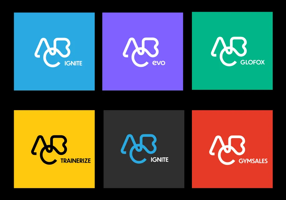
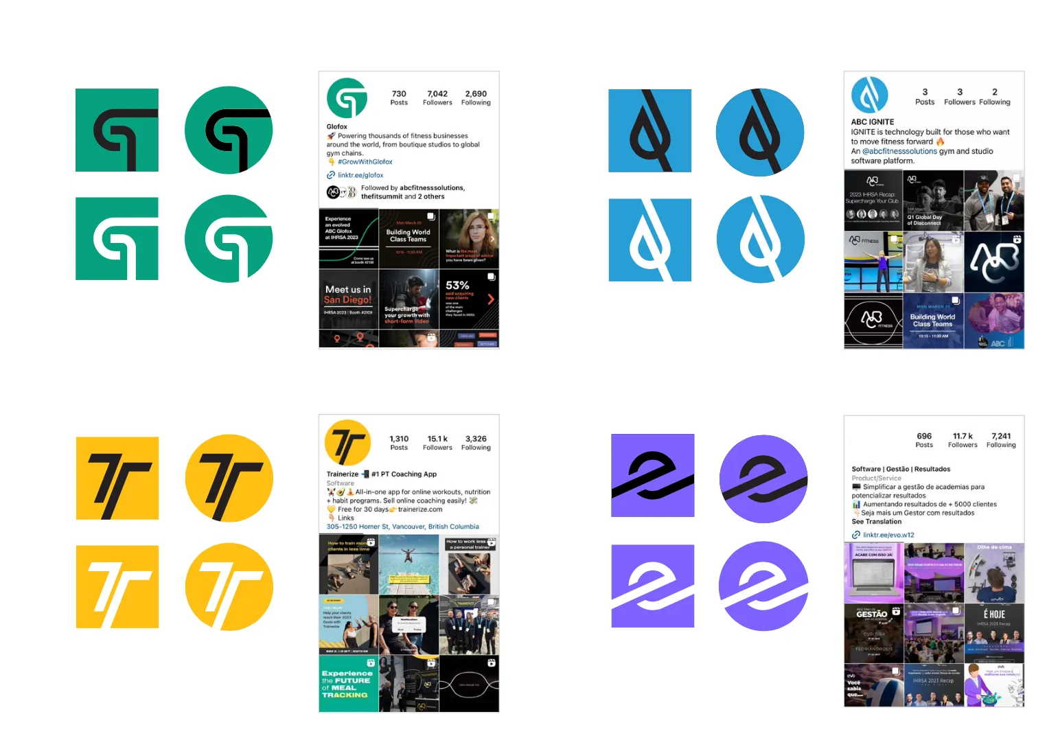
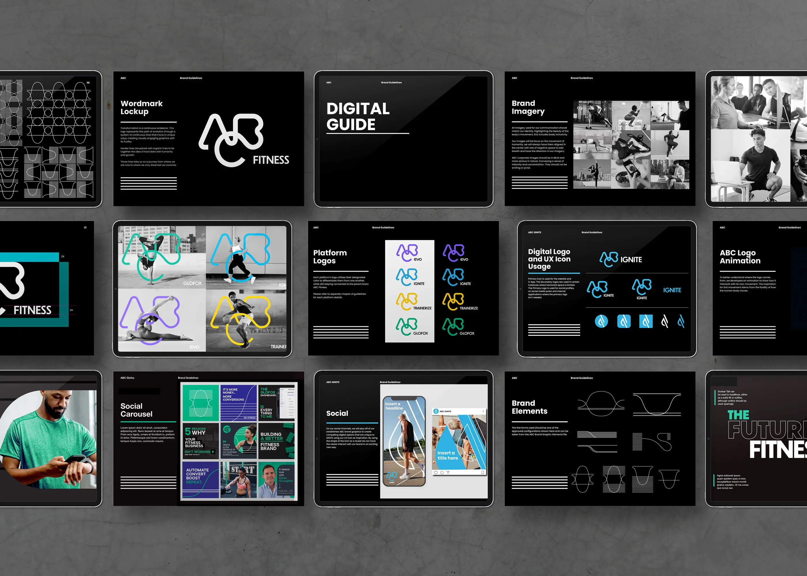
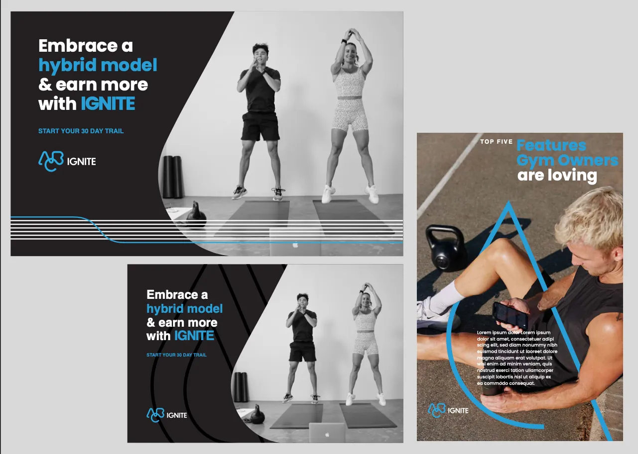
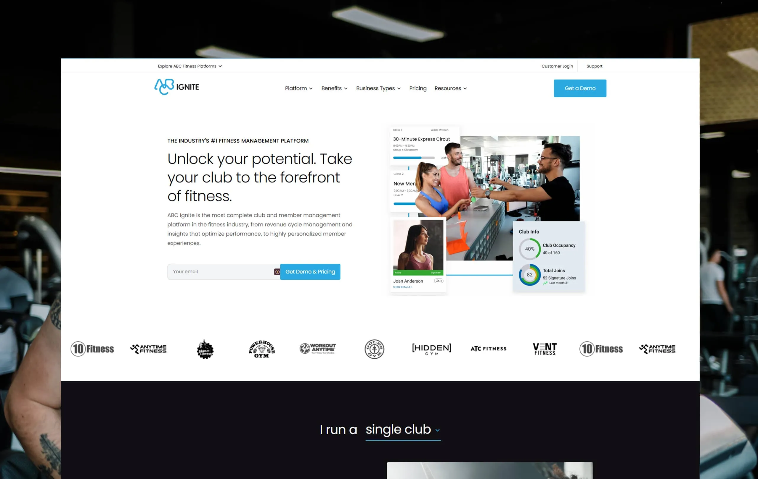
The system I authored sits deliberately between the two. The master identity carries the group, and each product holds its name in a consistent lockup, so a gym owner sees one company offering several tools rather than several companies offering one thing each. It gave the sales teams a single story to tell and gave the acquired brands somewhere to stand.
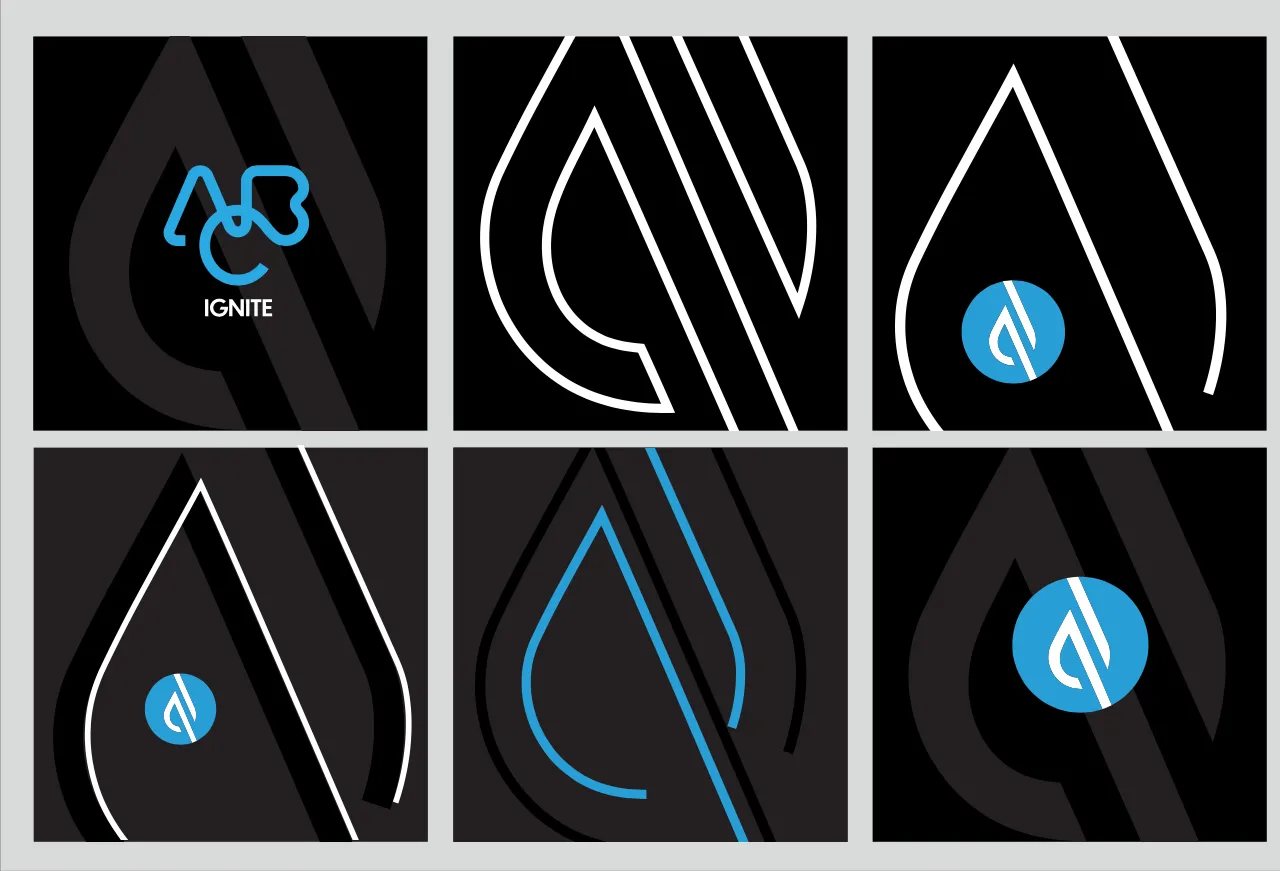
Making it hold up was a separate discipline. A system used by people in seventeen languages, most of whom I would never meet, only survives if the guidelines answer questions before they are asked. So the guidelines are built around decisions rather than around specimens.

What was rejected
The first route renamed everything into a single naming system, with the acquired products becoming descriptive sub-names of ABC. It was cleaner on a page, and it would have thrown away years of search equity and the specific trust that Glofox and Trainerize held with their own customers.
It was abandoned once the cost of retraining an entire market on new product names was set against what the tidier structure actually bought.
What shipped
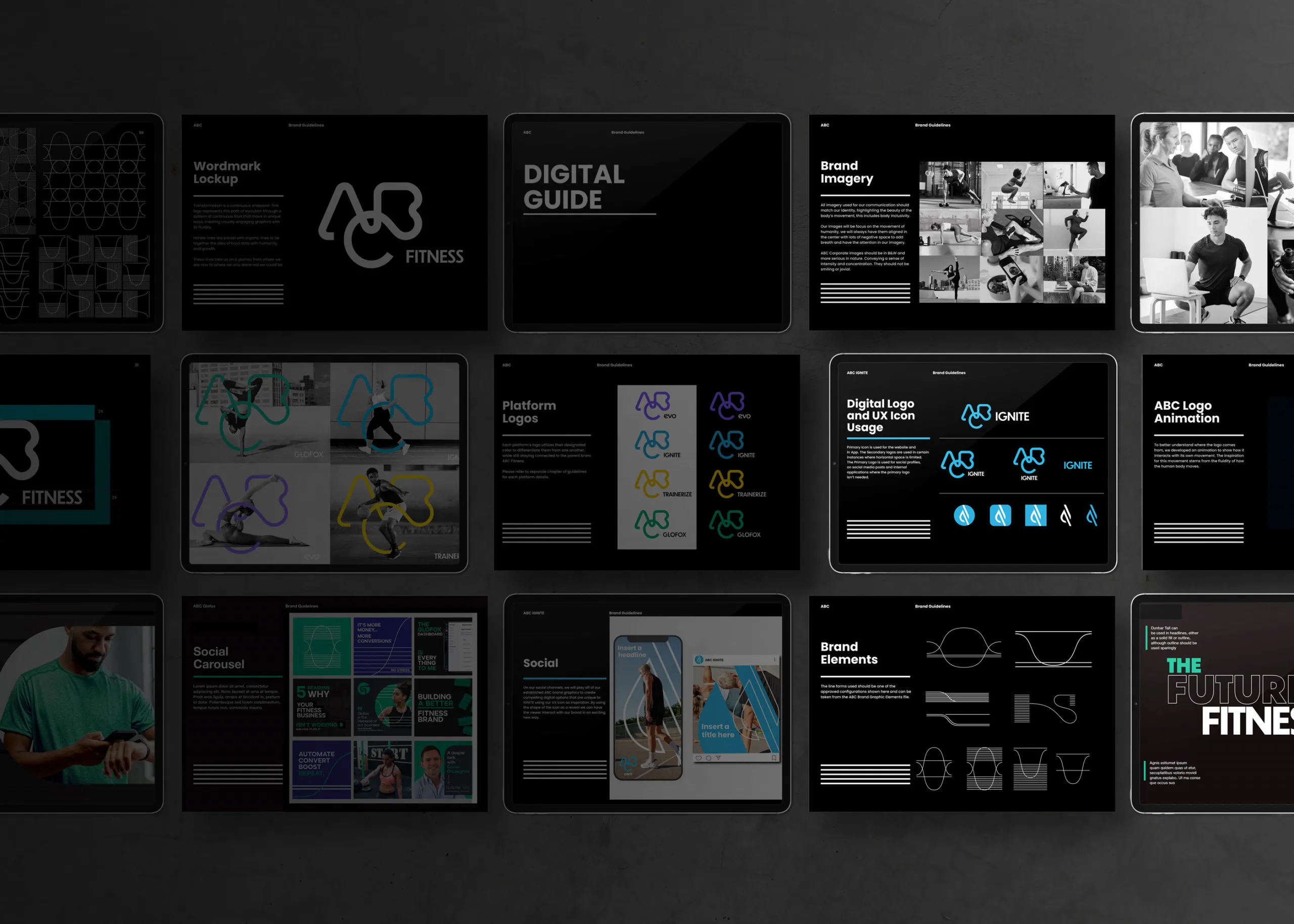
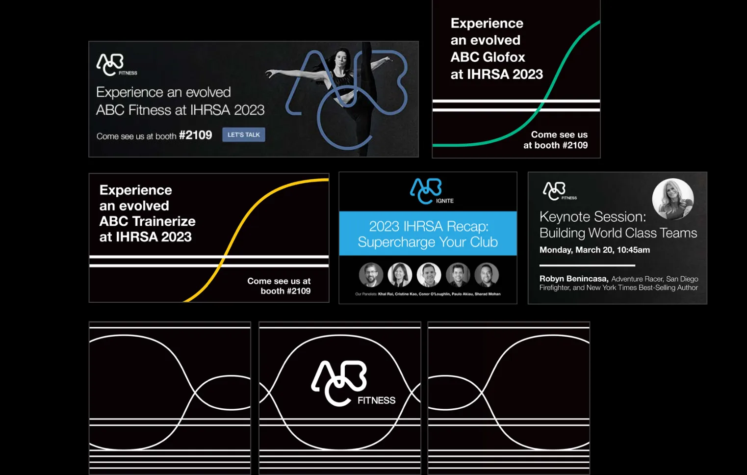
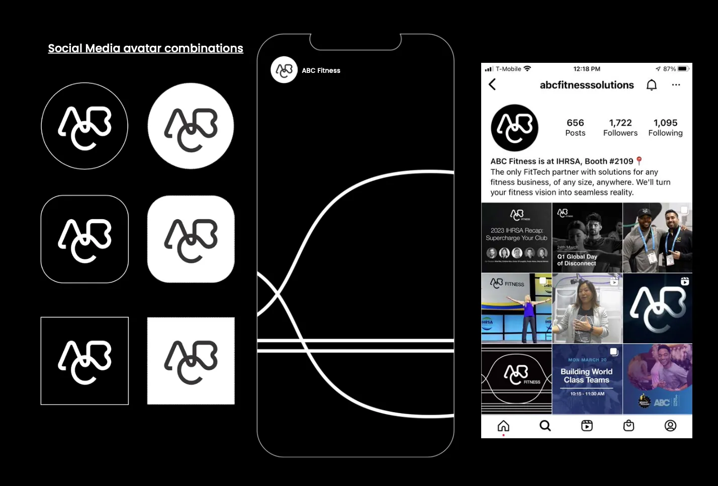
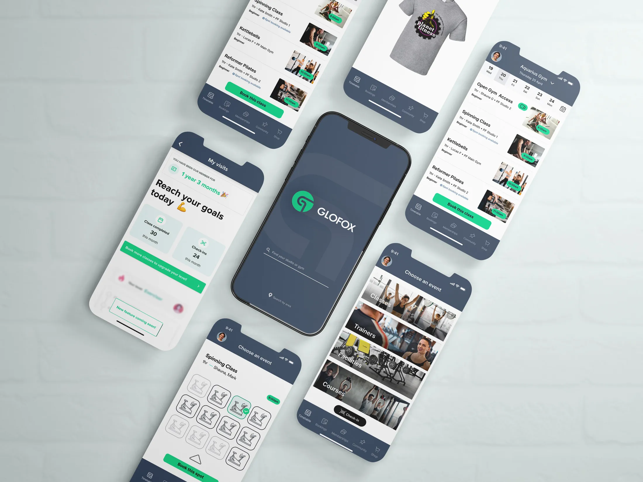
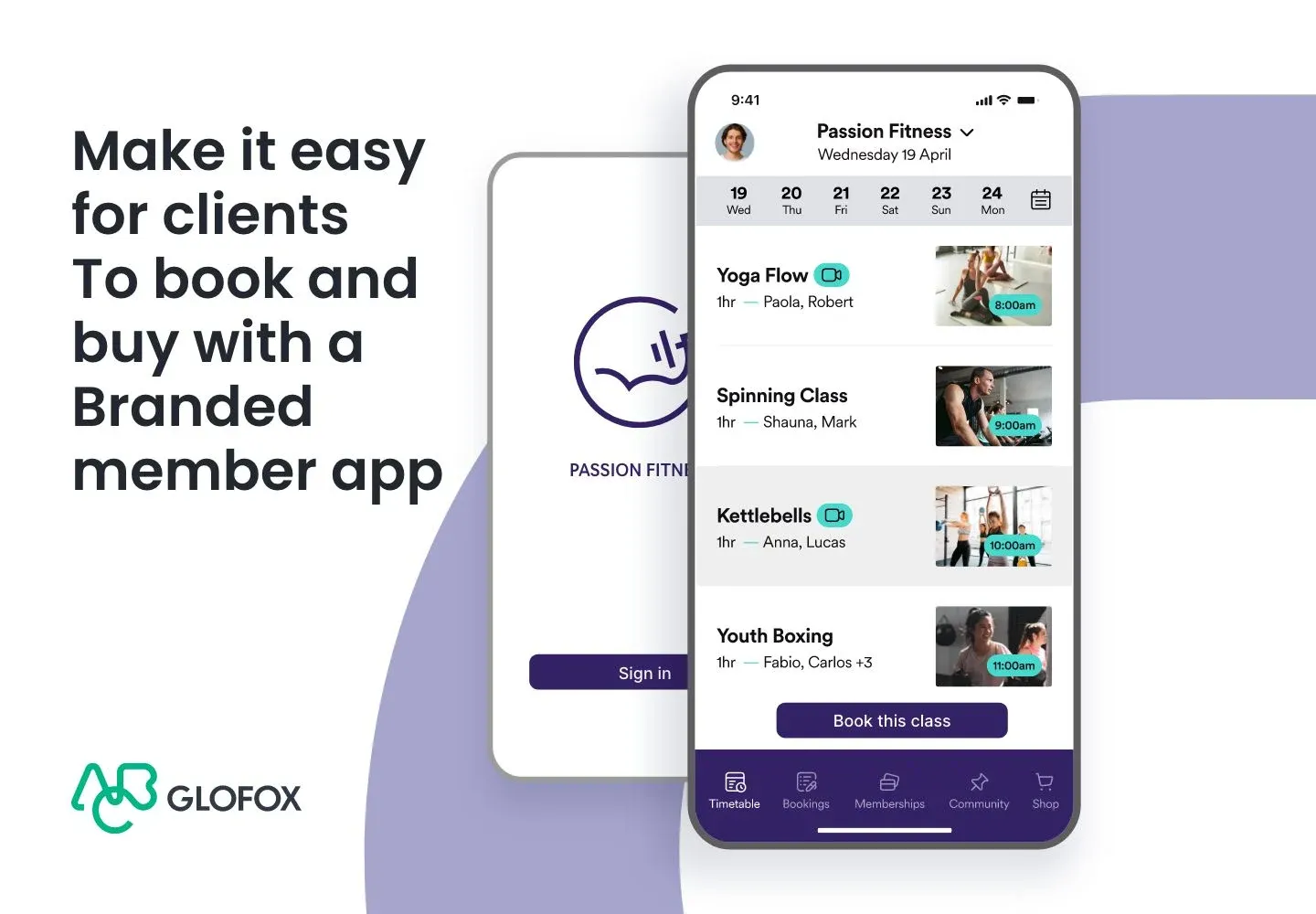
A master identity for the ABC brand family, the architecture that governs how the six products relate to it, and the guidelines and asset system that let teams apply it without me. It rolled out across a platform operating in more than eighty countries and seventeen languages.
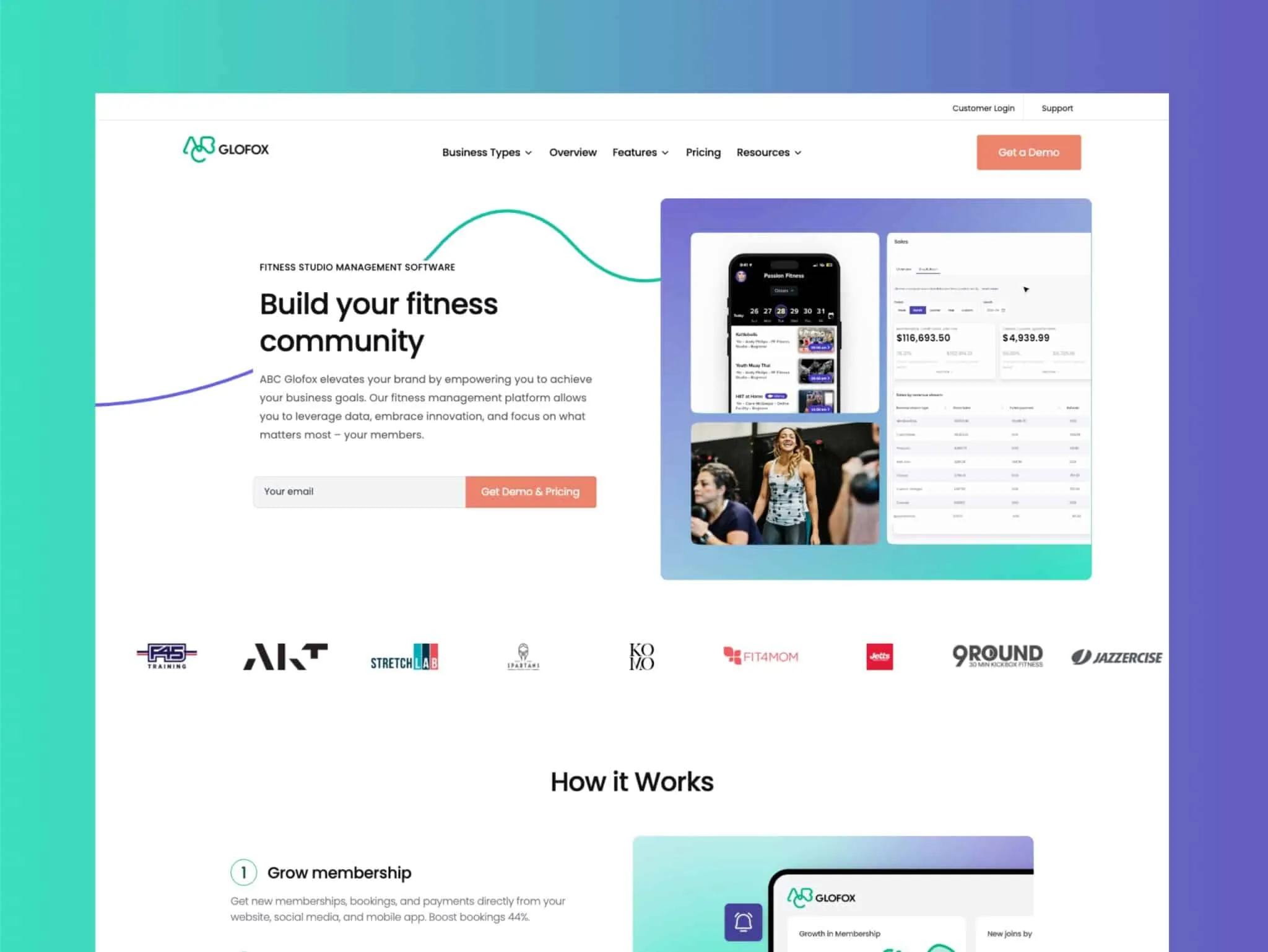
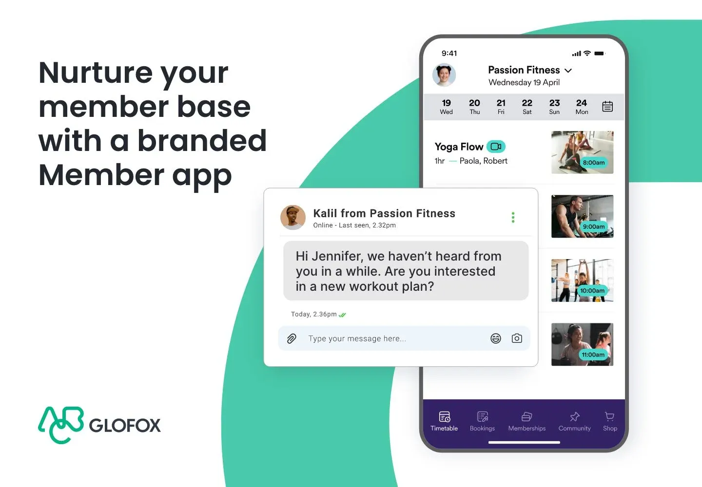
Alongside it I rebuilt the Glofox website around conversion, which meant translating dense software features into something a gym owner could understand in one pass, and wrote, directed and produced the customer journey films used across sales, onboarding and marketing.



What I would change
I would have written the guidelines earlier and in public, while the architecture was still being argued about. Publishing the reasoning as it formed would have surfaced the objections from the acquired teams months before rollout, when they were still cheap to answer.